
Kosovo’s National Library is more than its domes
White domes, angular building volumes and a mesh of aluminium holding the facade together. The National Library of Kosovo is easy to recognise but harder to place. Behind its controversial exterior lies Andrija Mutnjaković’s attempt to unite modern construction techniques with an older concept of how space, light and cities can be shaped.
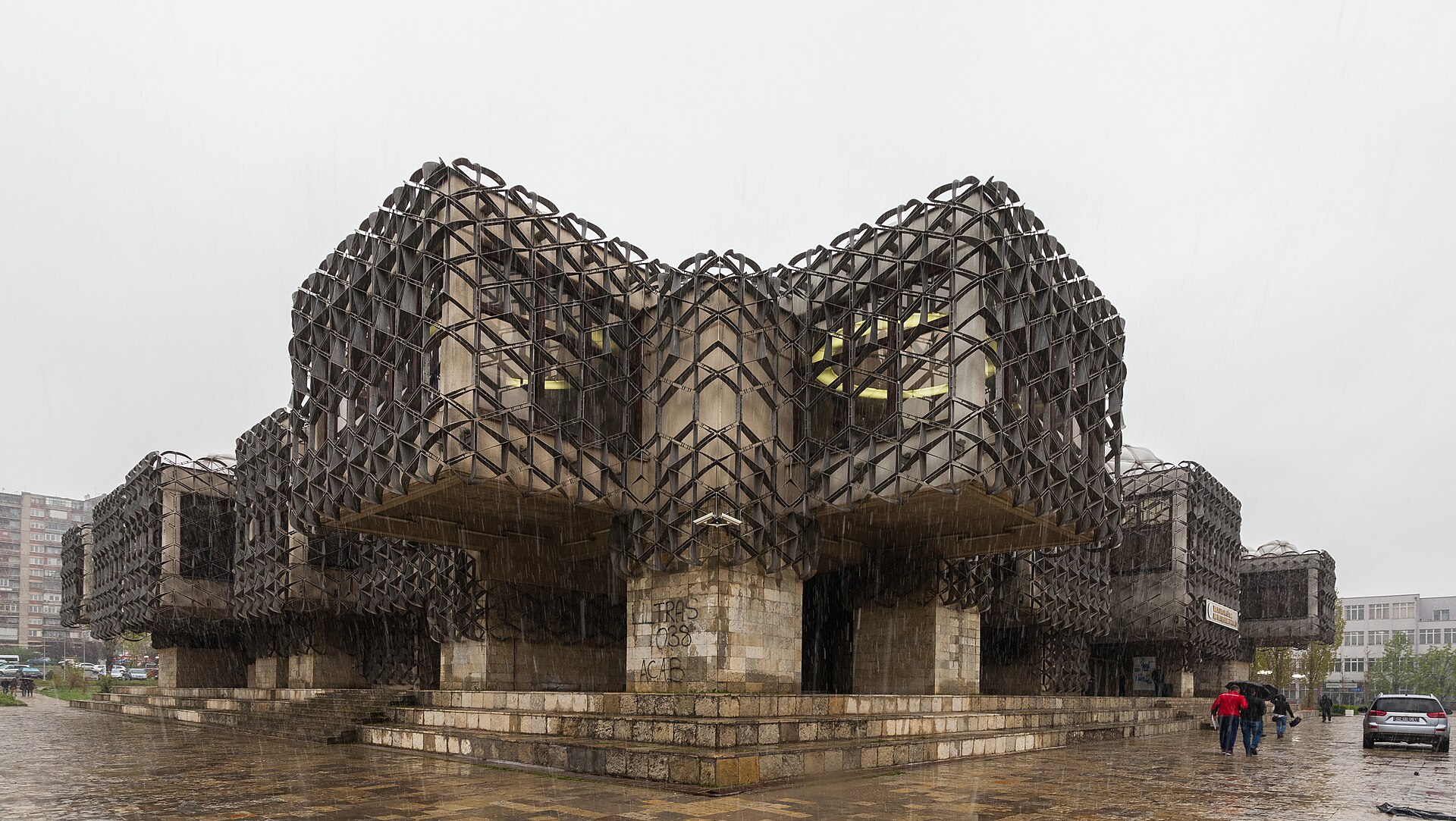
The gaze is given two conflicting instructions. The domes atop the National Library of Kosovo in Pristina lead it upwards, towards soft shapes and bright surfaces. The metal mesh pulls it back to the facade, where a dense pattern runs in front of angular volumes and windows. The building seems simultaneously to want to open up and to keep its distance.
It is in this tension that its architecture begins to get interesting. The mesh is not the wall itself. The domes are not just the building’s silhouette. And what may look in a photograph like a single compact building actually consists of interconnected parts, varying in height and scale.
Today, the library bears the name Pjetër Bogdani. But to understand its form, one needs to go back to another era and to the Croatian architect Andrija Mutnjaković. The 1971 design became the starting point for the building that opened in 1982, when Pristina was part of Yugoslavia. Between those years lies a project that was not content with merely providing rational storage for books. It also gave the city a building with its own headstrong architectural language.
Modernism without a single template
Yugoslav post-war architecture was no uniform system of grey concrete blocks. It encompassed austere international modernism, sculptural monuments, experimental hotels, and public buildings that sought connection with local building traditions. Architects worked with the same modern materials but drew different conclusions about what the future should look like.
Mutnjaković belongs to the experimental camp. In Pristina, he combined cast-in-situ concrete with domes of translucent acrylic and an outer aluminium mesh. The materials belonged to the modern construction industry. At the same time, the method of placing smaller spatial units side by side, and crowning them with vaulted roofs, opened up associations with much older architecture.
Brutalism is therefore a useful but insufficient label. It captures the building’s weight, distinct volumes and concrete structure. It says less about the fine-meshed metal envelope, the translucent domes and the care taken with the materials of the interior.
Marble floors and stairs are also part of the library, making the image of a purely raw concrete building misleading. Here, a heavy, angular structural style meets a more refined and representative interior. The library is both a workplace and a public institution, and the architecture makes room for both roles.
The dome is also a window
The domes have been subjected to many interpretations. They can bring to mind Byzantine architecture, Islamic building traditions, or the plisi, the white Albanian felt cap. These similarities are easy to spot. But a visual association is not automatically an explanation of the architect’s intention.
The plisi interpretation, in particular, needs to be separated from documented intent. The fact that a white, rounded roof shape resembles a cap is not enough to make the cap the building's documented inspiration. This reading also reveals how people attribute meaning to public buildings after they have been erected.
To understand the domes architecturally, it is more rewarding to start with the light. They are made of translucent acrylic, a material that lets light through without acting as a clear pane of glass. Thus, the roofscape is also an integral part of the interior’s daylight system.
Overhead lighting has a specific logic in a library. Light from the roof reaches parts of the room that light from the facade cannot, making it possible to design deeper spaces without requiring every desk to run along an outer wall. How well a specific solution works depends, of course, on glare, orientation and the condition of the material, among other things. But the principle itself helps explain why the dome should not be reduced to a mere symbol.
Dome-covered rooms and light from above have a long history, including in library architecture. In Pristina, this older spatial type is executed in an industrial material and repeated over several volumes. The historical echo and the practical function do not need to compete; the same form can support both.
A mesh that changes the scale of the building
From a distance, the aluminium mesh binds the different parts of the library together. It gives the volumes a shared surface, almost as if the building were wrapped in a continuous material. As the viewer draws closer, this unity dissolves into smaller components: patterns, fixtures, gaps, and the walls behind.
This is an important difference from standard facade cladding. The mesh does not completely hide the structure beneath. Instead, a gap is created between the outer layer and the building within. Light can cast shadows between the layers, and the darker surfaces of the windows achieve a different effect than the closed wall sections.
The metal is therefore more than just decoration added as an afterthought. It affects how the building is read. The large cubic forms provide a coarse rhythm, to which the repetitions of the mesh add a much finer one. The result oscillates between monumental building and highly detailed object.
However, one should be cautious about attributing a specific technical task to the mesh based solely on its appearance. An outer screen can affect solar heat gain and privacy, but its intended function must be distinguished from its observable effects. For the observer of the library, the visual impact is clear enough: open and closed are no longer straightforward opposites. Even a window is seen through an additional layer.
A library structured like a city
Another way of approaching the building is to read it as a small city. Not because it imitates a street lined with facades, but because several spatial units are joined together to form a larger whole.
The reading rooms, the connections between the building's sections, and the amphitheatre provide different kinds of spaces: for concentration, movement, and public gatherings. From the outside, the kinship between the parts is apparent without them disappearing into a single large box. Domes and cubes recur, but the varying heights of the volumes break up the mass.
The comparison with Diocletian’s Palace in Split is useful at this very level. Over time, the Roman palace complex has become part of the living city, with passages, courtyards, and buildings inside a cohesive structure. Placing the library alongside it helps us think of architecture as a system of rooms and connections, rather than just an exterior.
But this comparison should not be mistaken for a documented claim about Mutnjaković’s source of inspiration. It works as an architectural-historical reading, not as proof that the library’s layout copies that of the palace. The interest lies in the kinship of thought: a whole can be constructed from parts that retain their own character.
What the debate on ugliness misses
The library's appearance has made it a prime target for headlines about ugly buildings. Such lists are judgements of taste packaged as rankings, rather than a measure of architectural quality. Yet they point to something real in the encounter with the building: its shapes are difficult to resolve into a calm, harmonious image.
Anyone looking for clean lines is met with a dense grid. Anyone appreciating the softness of the domes sees them pressed against angular building blocks. The industrial expression of the metal jars with associations of older monumental architecture. For one observer, the result is cluttered; for another, this very friction is the building’s strength.
A more nuanced assessment therefore needs to move between exterior and interior, between silhouette and material. A photograph of the facade does not reveal how the overhead light works as a spatial concept. A close-up of the mesh does not explain how the interconnected volumes construct the whole.
This is also how the library becomes rewarding to observe in today's Pristina. Start with the domes, but do not stop there. Follow how the metal envelope runs in front of walls and openings, how the building volumes meet, and how weight is juxtaposed with translucency. One does not need to find the result beautiful to discover how much work it does with just a few recurring shapes.
Sources & further reading
- en.wikipedia.orgNational Library of Kosovo - Wikipedia
- sq.wikipedia.orgBiblioteka Kombëtare e Kosovës “Pjetër Bogdani” - Wikipedia
- kosovoarchitecture.orgKosovo National Library CMP – Kosovo Architecture Foundation
- hr.wikipedia.orgNacionalna knjižnica Kosova – Wikipedija
Share the article
Translated from Swedish with AI assistance. Read the original.


